Have you spotted that ServiceM8 Reports have had an overhaul? The reports section can be a great starting point for getting to know your numbers.
If you’ve read the The E-Myth Revisited, you’ll know that data is a key part of your business success.
“You can’t manage what you can’t measure.”
I’m passionate about reporting and analytics. The numbers often highlight the exact areas you need to work on – they take the guesswork out of running your business.
What was the reporting like before?
ServiceM8 reporting has always been one of the more limited areas of the tool (don’t get me wrong, I love ServiceM8, I just think the reporting could be better.)
The reports used to be generated with flash, but more and more browsers don’t support it properly.
“This content requires Adobe Flash Player, which is not supported by your device.”
The reports regularly failed to load (appear) on the page, so the experience was hit and miss.
What’s new?
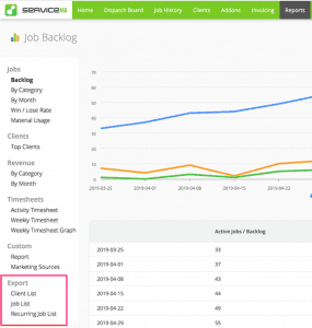
ServiceM8 reporting now uses technology called Apex Charts.
The graphs are prettier and much more interactive.
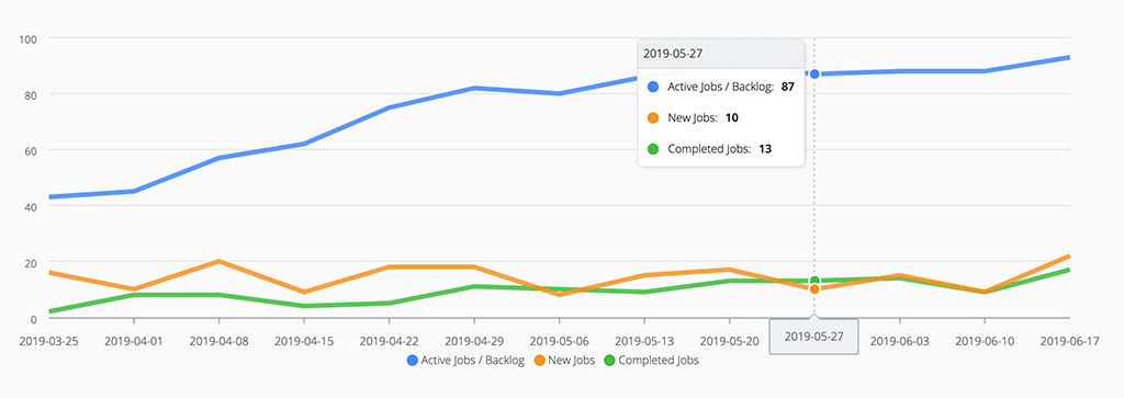
You can hover over all of the graphs to see more information:
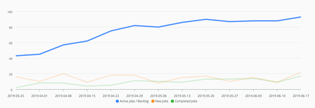
You can hover over the legend (the key at the bottom) to view individual items on their own:
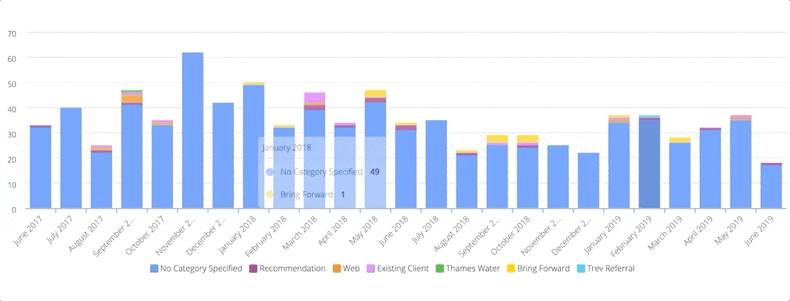
You can also click on the legend items to remove them from the graph – it’ll change the axis to show the remaining items more clearly:
Want more?
Though the improvements are welcome, they probably still don’t go far enough to provide you with enough of the right numbers.
There are other tools both inside and outside of ServiceM8:
Advanced reporting pack
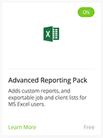
Go to Settings > ServiceM8 add-ons > Advanced Reporting Pack
This will give you extra choices in the ServiceM8 reports section. These options will allow you to download your entire job history and client mailing list into Excel.
You can then use pivot tables and charts to slice and dice your data however you’d like.
 Wink Reports
 Wink Reports
Wink Reports is a separate reporting tool. It talks to ServiceM8 and many other popular tools (Xero, Google Analytics, Google Adwords, etc) to allow you to build a variety of individual and combined reports in one place.
You can also create a schedule to allow wink to send you daily, weekly or monthly reports by email.
 Zrilo Business Insights
 Zrilo Business Insights
Zrilo Business Insights can tie together your Xero / Quickbooks and ServiceM8 numbers in one place.
It gives you a new page within ServiceM8 that shows you lots of graphs of your key numbers (KPIs).
What other questions do you have for me? Are you doing interesting things with your reporting?
